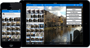
 Dropbox reported on its blog on Friday the launch of new iOS app that introduces a redesigned, streamlined UI, a new Photos tab that allows you to scroll through a timeline of your automatically uploaded photos, and improvements to the photo-viewing experience.
Dropbox boasted that uploads have now been improved, allowing users to ” tap the ‘+’ icon to upload something or create a new folder.”
We’ve packed a ton of love and tiny details into our new iOS design, and we think you’ll dig its simplicity. For example, we got rid of the text labels on our tabs in favor of clean and streamlined iconography. Splashed across the app is the glorious Dropbox blue you’ve come to know and love, and we’ve reduced complexity to make everything feel so fresh and so clean, clean.


