 Nokia have gone in hard with their product placement deals for the Lumia range, including Channel 4’s Hollyoaks, Sylvester Stallone and Robert De Niro’s Grudge Match, Man of Steel, Jennifer Lopez’ Life it Up music video, Kelly Clarkson’s People Like Us, Kesha’s Die Young, Gravitonas’ Call Your Name, Tinchy Stryder’s Bright Lights, Life as Lions’ Hollywood, Spleen United’s Open Music Video, Carly Rae Jepson’s The Kiss, Nicky Minaj’ Starships, Anna Vissi’s Riranniemai, DJ Koobra’s Something Real and Priyanka Chopra’s In my City and Flo Rida’s Whistle, to name a few.
The Lumia 1020 itself features in Katy Perry’s Roar, and pretty much stars in Ellie Goulding’s How Long Will I Love You, where it steals the show by not only appearing in every scene, but the music video of the charity single for BBC’s Children in Need was reportedly filmed on a 1020, too.
It’s safe to say that Nokia are pushing their Lumia smartphones as hard as they can, to the 16 – 34 market. But is shoving their phones in our faces enough? Can the phone hold up to all the attention?
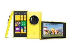
There does seem to be some debate about whether it’s attractive or not though – it’s certainly striking, especially in the signature yellow colour. But it’s not the smooth-meets-sharp edges that tend to turn people off, it’s the camera bump on the rear of the phone. It has been likened to a tumour sticking out of the phone’s back. It’s not exactly an attractive feature, but if you can overlook it, the phone is otherwise pretty stylish. It has a funky music video appeal to it. Or maybe that’s just the fact that the Nokia Lumia range has starred in more music videos than any other phone.
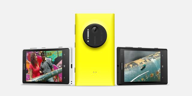
With a dual-core 1.5Ghz Snapdragon S4 processor, 4.5″ AMOLED screen and 41 megapixel camera, you’d think it’d be pretty impressive, wouldn’t you? However, as great as this package is, as with anything it’s only as strong as its weakest link and this phone has a pretty weak link in its Operating System. Windows Phone still isn’t ready – it’s just not there yet.
There are some neat features in Windows Phone 8, such as double-tapping the screen to unlock the phone, tapping letters in the address book to find contacts, and live tiles are pretty cool. But having a few unique features doesn’t make up for the lack of basic features that we’ve come to expect from alternative Smartphone Operating Systems. You can’t even change the background/wallpaper of your phone. There are two simple options, light or dark (see: black or white), and that’s it. You can set backgrounds for your lock screen, and you can display information there from social networks, emails or messages, and you can even automatically rotate through a selection of photos for the lock-screen image, which is fantastic – but it only leaves us wondering why these options aren’t available for the active phone background, you know, for when the phone is actually in use.
The keyboard is horrendous. It’s easily the worst Smartphone keyboard we’ve tried. It’s sensitive to the touch, and provides little to no feedback – it gives the sensation of tapping on glass. With the narrow key placement, it’s far too easy to perform typos. It’ll make you look illiterate to your friends over messages, so you’ll want to avoid it at all costs when it comes to work emails. The problem is, on most other handsets that wouldn’t be a problem. We weren’t particularly enthusiastic about HTC’s sense keyboard either, but that was okay, because we downloaded the official Google Keyboard from the Play Store. That’s another feature that simply isn’t possible on Windows Phone. Sure, you can download custom keyboards from the Microsoft Store, but you can’t set them as your default keyboard, so they’re completely useless.
The e-mail client leaves a lot to be desired, too. If you’re using Hotmail, you may be alright. But it’s not 1999 any more, and we’re not all teenagers jumping on MSN Messenger for the latest playground gossip. A lot of people use Gmail, and the default WP client is terrible at handling the service. There’s no archive button, for instance. The app will also randomly create its own labels, so instead of sent emails appearing in Gmail’s “Sent Mail”, they’ll appear in a brand new label “Sent Items”. Issues like this would be so easy to solve, it’s mind boggling that they haven’t been. There’s no push support for Gmail, either. With emails being checked every 2 hours by default. The timing of intermittent checking can be changed, but it’s far from ideal.
Gmail isn’t the only Google service that falls short on the Windows Phone OS. Because there are no official Google apps, you have to work with the apps provided by Microsoft and hope for the best. The contact importer appears to pull in an address book, and all the names and numbers may be there, but when a contact calls, it’s a lottery as to whether their name will appear or not. A bizarre bug that should be labelled a priority.
Switching between apps feels much lengthier than necessary, too. This phone has a lot of power behind it, so there’s no need for it to feel slow, other than poor software design. With transition screens appearing every time you switch back to an app, essentially loading everything up again, makes multitasking a chore.
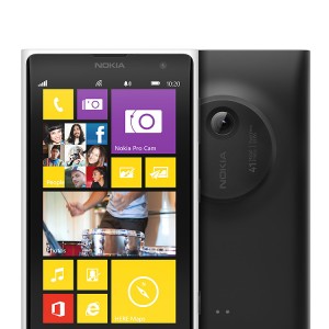 Not everything about the OS is bad. Customisation of the home-screen is easy, the metro look actually works really well on a phone. When the phone is locked, it can display a big bold clock with a single tap, that’s a handy one for the night-stand. The ringtones are quite nice too, which the reminiscent Nokia Tune seeing a bit of a remix. But none of these points are enough to make up for all of the shortcomings. There’s even an inconsistency of which side the okay and cancel buttons are placed, making for a really confusing experience. In fact the annoyance with Windows Phone 8 started during set-up, where you have to un-tick options to send your data to Microsoft at least half a dozen times. That’s a handful too many.
In all fairness, the biggest downside of Windows Phone OS has always been the lack of apps, and that problem is gradually being fixed. The big ones are all there now, with Twitter, Instagram, Facebook, WhatsApp, FourSquare, and Spotify. It’s just that if there’s something new or niche that you want to download, it most probably won’t be available.
As a camera, the Nokia Lumia 1020 really comes into its own. It shines as a fantastic piece of tech, and its almost worth buying for that alone. Every photograph has so much depth to it, though. All of those pixels allows for some high quality photos, you’ll have your own CSI “enhance that!” moments on a regular basis, zooming in to crazy levels of detail. There is a slight problem with taking close-ups, where the auto-focus will lock on to an object and then immediately lose focus, causing blurry pictures, but thanks to the manual focus options, you can work around that. When it comes to taking photos in low-light situations, there is none better than the Lumia 1020; it’s superb.
It’s such a shame that Nokia were recently acquired by Microsoft, because it unfortunately means we’ll never see these handsets running Android. The Lumia 1020 really is a great handset. But while it’s running Windows Phone 8, we cannot recommend it as a solid purchase. Honestly, you’d be better off buying an iPhone or one of the latest Android handsets. Windows Phone is the third OS in a two OS market. Nokia have essentially made themselves the Liberal Democrats of the mobile phone world.


